It’s a truism that post-processing can make a good photograph better, but can’t make a poor photograph good. Photoshopping (or in my case GIMP-ing) can only work with the information that is in the image; it can’t create detail out of blur. I’m talking here about post-processing a realistic image, with the intended result to be an even better realistic image. (To use Photoshop to create an abstract final image is a perfectly good thing to so, but not the topic here.)
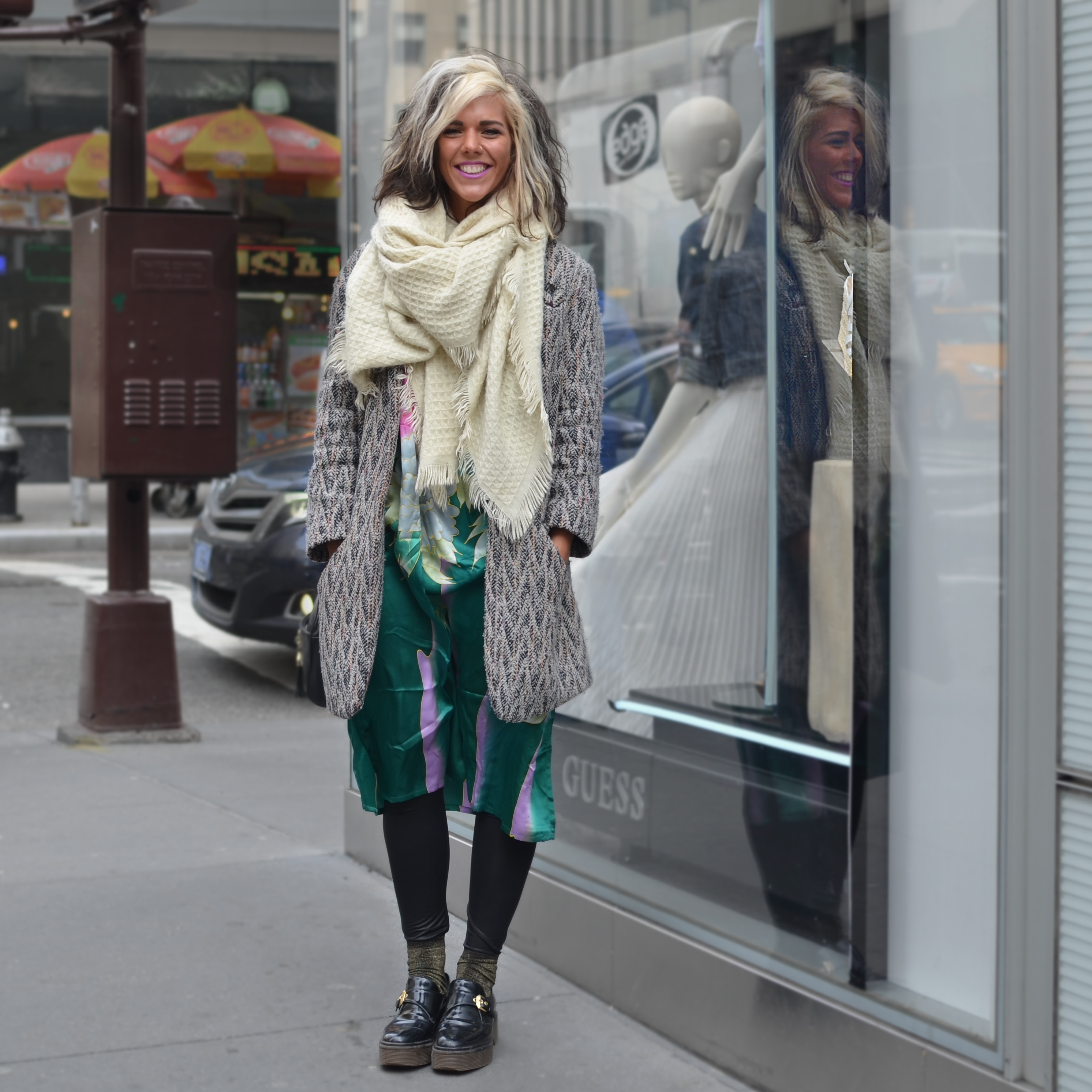
I took a picture of a stylishly dressed girl on Fifth Avenue recently. It was not the greatest photo ever taken: overly busy background, no dramatic lighting, compositionally boring — but the subject was compelling and her reflection was a nice detail.
Here’s the image straight out of the camera:

girl on Fifth Avenue
This image offered many opportunities for improvement with post-processing.
First, that reflection. It’s split by a sharp white line. So I selected the right part of her face and pasted it back, minimizing that disruptive line. Some use of the Heal and Smudge tools fixed it up nicely. This detailed, pixel-y work took the most time of the whole process.
Having improved the reflection, I selected everything *but* the girl and her reflection, all that overly busy background. In this selection step, it’s important to Feather Edges, so that the work done to the image does not leave a sharp, revealing edge. I then reduced its color saturation, darkened it a little, and blurred it a little. Making these three changes, each one to a small degree, reduces the visual impact of the background, but does little violence to the natural appearance of the whole picture. (Many articles will quantify the author’s use of tools, do this by 15%, or set Feather to 50 pixels, or set Gaussian Blur to 10 pixels, etc. You have to judge each image and and each step by itself. You develop a feel for the proper amount to use as you become familiar with them.)
Now here is a step that I *will* quantify. 🙂 Increase the image height 5%. It makes the subject look just a little thinner. At 5%, it’s almost imperceptible, but it makes a more flattering picture for almost all of us.
I then cropped it to an Instagram-friendly square format, taking care to balance the placement of the girl and her reflection. Normally, I’d place her dead center, but in this shot, I wanted to bring the reflection in towards to center too. Again, the degree is a judgment call.
I had had my eye on those distracting yellow & red umbrellas and lights across the street. I did some serious Burning to darken them up and make them less distracting.
At this point I noticed a very bright white line, just to the left of the reflection. With the color-select tool, I selected it all and darkened it. Wow! I was surprised at how severely I could darken it (90%) and still retain a realistic image. Her reflected face was a little dim, so I Brightened up that a bit.
Here’s the final result:

Girl on Fifth Ave – square format
Overall, I spent more time in post-processing this picture than I like. Tweaking the reflection, with all that cutting-&-pasting and pixel-level Healing was a pain. All the rest of the work was pretty straightforward and quick.
Final note: I should have spent just a little more time darkening that bright, crinkly bit in her reflection. It’s an unnecessary visual distraction and could have been reduced easily.